

Improving the User Experience for a Non-profit
A UX case study for Clothed by Faith
Project Information
Year
2023
Duration
16 weeks
Tools
Figma, Illustrator, Miro
Role
UX/UI Designer
Design Process

Empathize
Target Audience, Qualitative and Quantitive Research

Define
Personas, User Stories, Brand Identity

Ideate
Information Architecture, Lo-fi Prototyping

Redesign
Suggestions, and Reflection
Overview
Disclaimer: I am not affiliated with Clothed by Faith in any capacity
In the very diverse and populated city of Houston, there are hundreds of non-profits working to change lives - Clothed by Faith being one of them. This particular non-profit organization, which works to provide the less fortunate with clothing, really impressed me with their strong values in faith and dignity. After being a volunteer for CBF, I gained an appreciation for the organization, leaving me with a strong desire help further spread their mission. I planned to do so by improving their website’s user experience to improve usability and accessibility.
Through usability testing, I discovered accessibility and navigational issues in which users were overloaded with information, with no clear direction when navigating through the website. Based on these findings, as well as from demographic research, I designed possible solutions to improve usability.
Objectives
In taking full responsibility of the different roles involved in product development, I hope to accomplish two main goals for this case study:
Increase awareness of the organization’s mission through improved UI.
Identify current pain points of the Clothed by Faith website in order to facilitate a better user experience through a redesign.
01 Empathize
To begin my case study, I did an analysis on audience demographics to get a better understanding of Clothed by Faith’s users. I then dissected the current state of the website to get an understanding of what works and what could be improved, while also taking note of brand attributes. I then conducted an interview to gain further insight on how users experience the website, gathering qualitative data.
Target Audience Demographics
Clothed by Faith reaches out to people in the Greater Houston Area with two branches in Deer Park and Katy, Texas. Specifically they serve many lower income schools and families. Volunteers are typically women middle aged and up.
Below, the ethnic makeup for each city as mentioned above is charted, giving insight into the demographics regarding both Clothed by Faith’s clients and volunteers.
With a large portion of the population being hispanic, it can be further noted with data from the U.S Census Bureau that:
34.95% of the population speaks Spanish as their first language.
With Clothed by faith serving low income families, I also took a look at the ethnic composition in regards to median household income in order to get further insight into their clients. I found that there is income inequality for Houston in which:
White households earned 109% more than Black households, and 74% more than hispanic households.

Target Audience - Takaways
When clicking through the CBF website, I made a few quick observations:
Users are overwhelmed with information and choices
I could not find a clear CTA on the homepage, and on some interior pages
It was not always obvious what was clickable or not
With the demographic data in mind, it can be understood that Clothed by Faith caters to a large white and hispanic population, some of which may not speak English fluently, especially in regards to their clients. For this reason, I aim to make the website accessible for both English and Spanish speakers.
Current State
Sample pages from CBF

Home Page

Below the fold on the home page


Give Page
To confirm my findings, and to gain more insight, I conducted some interviews using open ended questions to gain qualitative data regarding the user experience.
I interviewed 15 people as they clicked through the CBF website for 5 minutes. Afterwards, I asked them questions regarding their experience. Despite a small group, I worked to reduce bias by including both males and females, ranging from ages 16 to 62. I asked three discovery questions in order to get a better understanding of what the participants expect from websites and nonprofits to better educate my data. I then asked three open ended questions directly regarding the Clothed by Faith website.
Qualitative Research
Volunteer Page
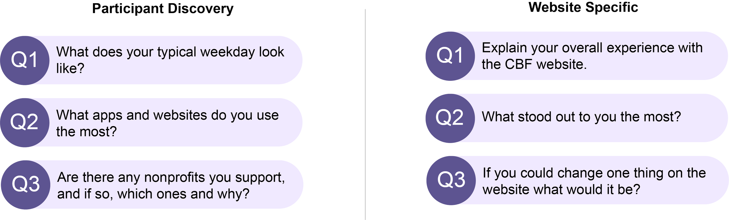
Interview Questions
Insights and Pain Points
Here is what some of the participants had to say:
“The purple is overwhelming”
“There is a lot going on here”
“This website is strongly Christian based”
“I didn’t know where to go next”
Based off the answers, there were two glaring issues
60%
of participants mentioned an overwhelming amount of imformation
53%
of participants stated that nothing stood out to them besides CBF being faith based
Other issues mentioned included:
poor contrast and readability
an unclear concept of the websites’s purpose
In the define phase, I created two personas based off my research on user demographics as well as my qualitative data to help further understand my users.
These personas are to represent the needs of a larger audience on the CBF website, while helping me to build empathy by humanizing the users. The user stories attached are to inspire and inform design decisions, by keeping the problem user centered with a definite “who”, “what”, and “why”.
02 Define
Personas

Meet Elizabeth, a volunteer for Clothed by Faith

Meet Katie, a client at Clothed by Faith
Brand Attributes
Considering that Clothed by Faith is a non-profit backed by values of God and faith, I felt that it was important to clearly define their brand attributes, in order to keep my redesigns in line with their brand.
Mood
Hopeful, Loving, Friendly
Voice
Informative, Passionate
Style
Classic, Eloquent
Logo

Color Pallete
#AD96DC
#5D5491
#000000
03 Ideate
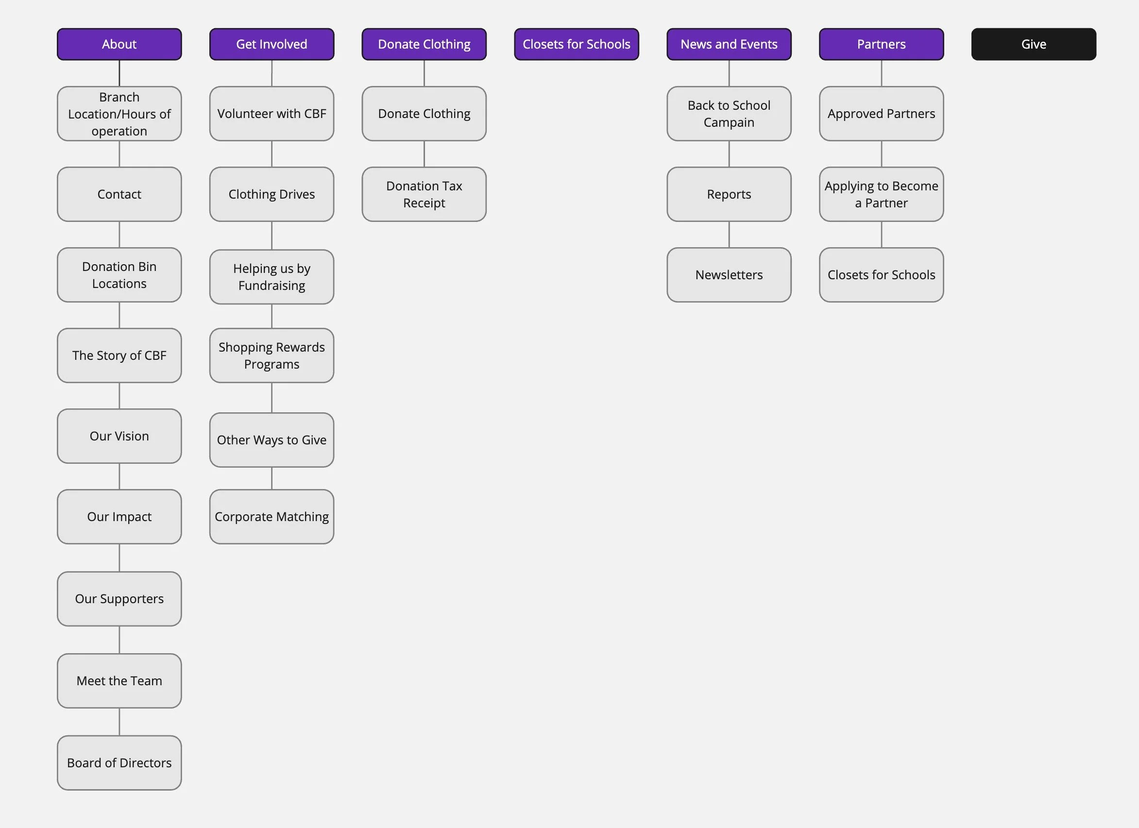
Current Information Architecture
Revised Information Architecture
Currently users are presented with an overwhelming amount of options

The revised information architecture, improves the overall organization while condensing information to improve cognitive process.
Improvements
Removed the Donate Clothing tab, creating a cohesive Donate Clothing page under the Get Involved tab
The “Story of CBF” and “Our Vision” condensed onto an About Us page
Removed the Closets for Schools tab, moving it under the About tab
Removed the Board of Directors page, incorporating it into the Meet the Team page
Incorporated some pages into the Other Ways to Give page to reduce choice paralysis
(not pictured above) I later chose to change the “Give” button to say “Donate” for greater clarity
Lo-Fi Prototyping
After getting an understanding for what needed improvement, I began to sketch out some preliminary ideas for some of Clothed by Faith’s main pages..


04 Redesign
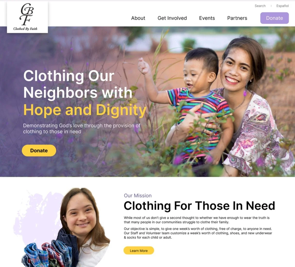
Suggestion #1 - Redesigned Homepage
For the homepage, I added a clear CTA on the hero section. Additionally, in order to push for a clear mission, I incorporated visuals and added more personality to the website, while still working to align with the mood, style, and voice of Clothed by Faith. Lastly, I transformed the “ways to get involved” section to increase internal navigation.

Current:

The current home page which lacks a CTA or clear visuals. It is also very text heavy
Below the fold on the current home page. Each way to get involved is clickable, but it is not immediately obvious
Redesign:
The redesigned home page
Suggestion #2 - Accessibility Improvement
I added an easy language switch between English and Spanish on the nav bar in order to accommodate CBF’s diverse audience

Current:
Currently translation is only provided on select pages and is mixed in with English, unnecessarily increasing scroll time
Translation Redesign:
Translation is now accessible for each page, easily found at the top navigation bar
Suggestion #3- Condensed Information
Since the majority of users were overwhelmed with information, I used the principles behind chunking and gridding to break up the information on key interior pages, making greater visual interest
Current - Shopping Rewards:
Current page for Shopping Rewards Program
Redesign - Shopping Rewards:
Different programs are sectioned out to where users can easily chose to view their relevant store without scrolling
Current - Donate Clothing:

Current page for donating clothing with an overwhelming amount of text
An additional interior page under the donate clothing tab for obtaining a donation tax receipt

Redesign - Donate Clothing:

A revised donate clothing page with greater organization of information
I incorporated the donation tax receipt onto the main donate clothing page along with other information, helping users find the relevant information they need all in one place.

Making use of accordions to create managable sections

Current - Volunteer:
Current volunteer page with redundant buttons and a lot of information
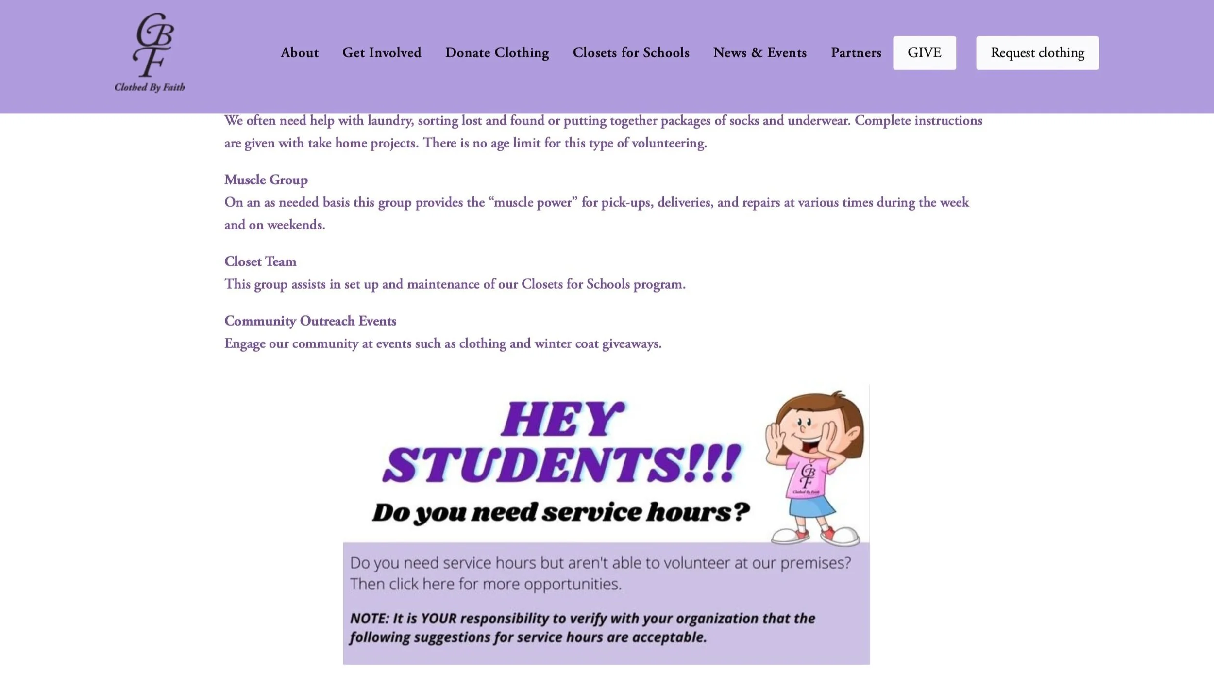
Further down the volunteer page
Redesign - Volunteer:
Usage of iconography and grids to break up information
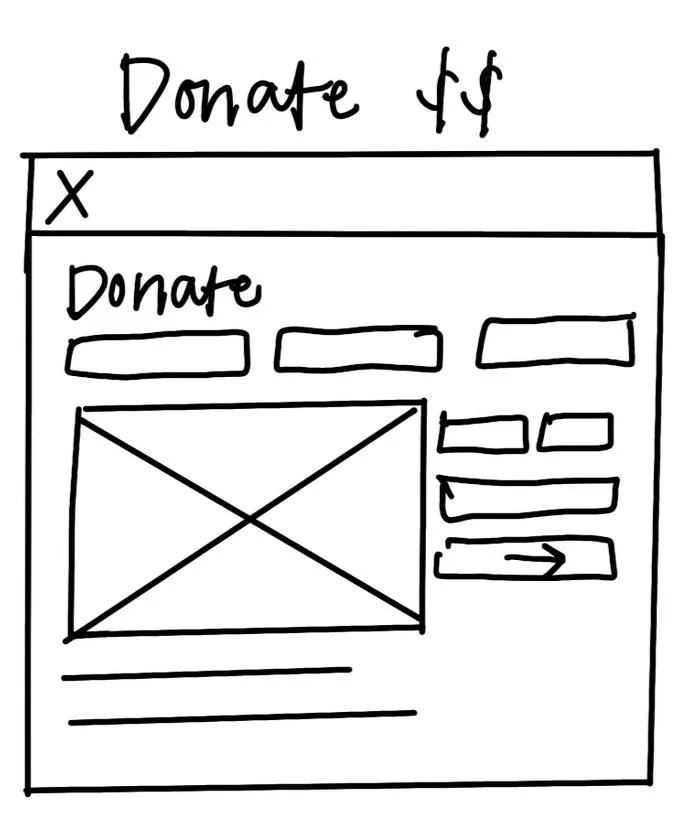
Current - Donate:

Immediately upon landing on the “give” page there is no clear direction or drive to donate
Redesign - Donate:

Clear distinction on what a user is donating
Suggestion #4- Color
To call more attention to key actions, I chose to add a secondary color to the websites original palette. I chose yellow, as in color psychology, it is commonly associated with happiness and optimism, aligning with Clothed by Faith’s emphasis on hope, while acting as a nice compliment to purple, boosting contrast. While a client may not agree to adding a secondary color, I chose to implement the yellow as a suggestion to enhance visual interest and focused attention.
Updated Color Palette
#5D5491
#AD96DC
#F0E9ff
#FDD142
#FFFBEF

The Color Palette in Action

Reflections
Being my first case study, I was very nervous to tackle this project. I wanted to respect the Clothed by Faith brand while also working to provide valuable improvement to the user experience.
In diving into the complexities of a real-life organization, I was initially overwhelmed on where to start. This case study challenged me to stick to a process, in which I was able to grow my problem-solving skills in the end.
While this was an unsolicited redesign, in continuing the design process, I would one day hope to perform validation testing with my redesign taking further steps towards improvement of the user experience.
Thank you so much for taking the time to view my case study!
See more of Caroline’s work

Wise Pantry - App Development